By this point in your contact centre career, you probably know what dashboards are, and how to use them.
In fact, you probably spend a good portion of your day looking at them!
But how do you know what a great dashboard actually looks like?
If you’re in the market for a new solution, how do you know what dashboarding functionality to look for?
And if you’ve just invested in software with a fantastic new set of dashboards, how do you ensure you’re getting the most out of what you’re paying for?
Dashboarding basics
![]()
In the context of a contact centre, a dashboard is something a user, team leader, or manager sees prominently on their interface.
Pretty much any contact centre/dialling solution will have dashboards. They’re also a very common feature in CRM software solutions, accounting software, rostering software, and pretty much any products that help to track performance.
As Paul Ho, Contact Centre Operations Manager at Container Exchange Services put it:
“[dashboards] typically create transparency for everyone, not just the team leaders or the contact centre managers of course, but also the agents, which is important. The dashboards are our eye in the sky.”
The team at CES use contactSPACE dashboards to monitor performance in real time, which is crucial, because the team handle thousands of inbound inquiries on any given day.
What makes a good dashboard?
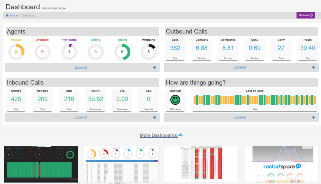
A contactSPACE call centre dashboard.
A good dashboard will provide real-time insights into what’s going on. More specifically, it will let you know about the outcomes that matter to you.
It’s basically how you keep your finger on the pulse.
For a call centre agent, they might see how their calls are going for the day, and the amount of time they’ve spent on different activities when logged in (talking, previewing, wrapping etc).
Likewise, a manager or team leader might be able to see the aggregated performance of their teams, as well as any other operational metrics that matter to them.
Importantly, a dashboard should display information that has easily-understood meaning, as opposed to raw data. For example, graphs/charts can be used to make it easier to interpret a dashboard at a glance.
When evaluating different call centre software solutions, you cannot just assume that the dashboards are the same. The solution must be fit for purpose.
You need to ensure that:
- The dashboard updates information in real-time. If results drop in one of your initiatives, you need to know about it immediately. Remember, the “dashboard” most people are familiar with is the one in their car. If your speedometer was even 3 seconds behind real-time, it would be rendered quite useless.
- The dashboard can display the right information to the right users. For example, you might want to create different dashboards for agents, team leaders, and managers. Inside each of these dashboards, you need to be able to select and display the most important KPIs in a way that can be easily understood. For example, a team leader might need to just manage the performance of their specific initiatives – not those of the whole contact centre.
- Dashboards have the right visuals to help you discern meaning. For example, colours are a great way to instantly differentiate a good reading (green) from a mediocre score (yellow) to a poor result (red). You may also want to have charts/graphs to make things easier.
Note that dashboards are normally quite different to call centre reports.
The difference between dashboards and reports is this: reports are meant to be used to develop deeper insights, while dashboards are supposed to provide at-a-glance updates on what’s going on.
You would use a dashboard like a doctor’s check-up, to ensure your operations are healthy. If something goes wrong, like your contact rates drop, you might use your reporting functionality to get to the bottom of why this occurred, and exactly how this drop affected results in the long run. But the dashboard’s job is only to show you what’s happening at any given moment (or on any given day).
What makes a great call centre dashboard

Creating a great dashboard is a balancing act.
Too few indicators, and you might miss out on something important. But too many, and you’ll be swamped – and spend far too much time looking at the dashboard to ensure everything’s OK.
If some of the included KPIs are relatively meaningless, you’re going to stop paying much attention to them. Therefore, it’s good to be picky about what to include.
What should be included

Depending on how much space you have on your screen, you might like to use the 3×3 rule.
First, pick 3 super-important top-level metrics, like the number of conversions, calls, and/or contacts.
Then, include 3 mid-level KPIs, that feed into the first three. For example, contact resolution rates, or your current service level.
Finally, you can show 3 more granular outcomes – maybe something that is specific to your firm, or stats about agent activity.
Beyond this, you can also think about different dimensions for analysis of each of these metrics. For example, segmenting inbound and outbound calls separately can be a good idea.
Ultimately, when choosing what to include on your dashboard, think about who will use the dashboard, and what information it would be useful (and not useful) to immediately present to them.
You don’t have to limit yourself to just nine different metrics – you can use as many or as few as you think will work for your team. The golden rule is this: the KPI should be relevant in the context of the dashboard.
What shouldn’t be included

Dashboards are not static, and should not be long-winded, like reports can be. Therefore, numbers that rarely ever update, or which are only important once in a while, should generally be kept away from your dashboard.
You can think of a dashboard a bit like a heart rate monitor. Nothing except the bare necessities are displayed on this piece of equipment. You simply use it to keep track of the baseline health of the patient – in this case, your contact centre.
This isn’t to say that you should just pick one metric, and measure that. The total number of calls on its own may not provide all that much insight.
Don’t be afraid to cull metrics that aren’t providing immediate value to your dashboard.
To tell how useful a certain KPI is, try make a dashboard with more data-points than you know you need. Over the course of a few days, see which ones you’re beginning to pay less attention to. You’ll soon discover why less is more.
If certain metrics are too important to do away with, but you’re not always keeping an eye on them, you can always create higher-level dashboards or reports to use on a less frequent basis – for a weekly checkup for example.
The importance of being flexible

Every contact centre changes a certain amount over time – and your dashboard should too.
If you’re beginning to become more outbound-heavy for example, you might want to introduce metrics like your speed to lead, conversion rates, and preview time.
To determine if your admin dashboard needs editing, see if you ever find yourself wandering to other areas of your interface to find the information you need. If there’s something you always go to, throw it on your dashboard and see if it makes a helpful addition.
For agents, you need to manage their dashboard as a part of their broader motivation, and also their broader workflow. Think about what you can provide them to keep them on track, in terms of showing them areas in which they are performing well, as well as areas where they could improve. As the nature of your initiatives change, your dashboards should evolve in line with user objectives.